What Book Covers Are Quietly Telling You Before You Read a Word
From bold block lettering to painted florals, cover trends are signals. A bookseller explains how to read them, and when to ignore them.

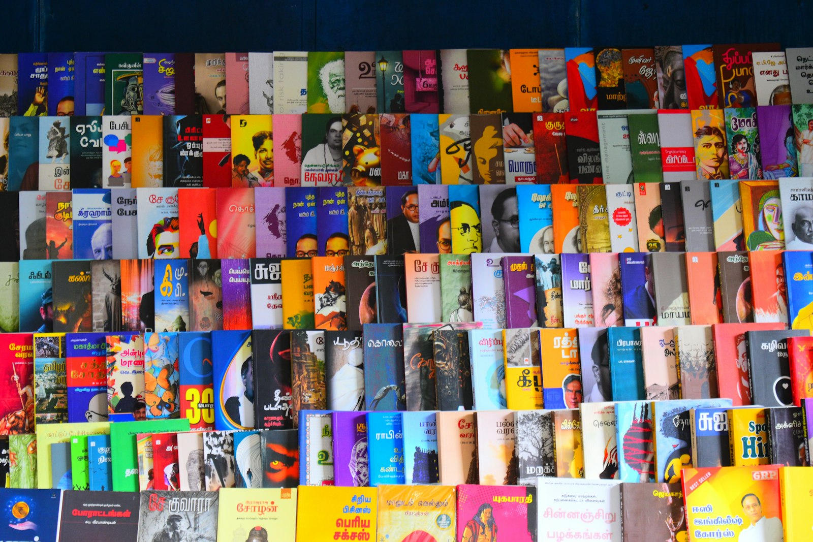
Stand at the front table of any bookshop and you will notice that many new novels look strangely alike. A few years ago it was big, hand-drawn lettering over flat, bright colours. More recently I have seen a wave of moody painted landscapes and old-fashioned botanical illustrations. None of this is accidental.
Covers are marketing, and that is fine
A cover's main job is to tell a browsing reader, in about two seconds, what kind of experience the book offers. Publishers study what has sold well and design new covers to signal if you liked that, you might like this. Readers learn these signals, often without realising it.
In my shop I have watched it happen. When we moved a debut literary novel from a back shelf to a table next to two similar-looking bestsellers, it sold fourteen copies in a month. In the previous three months it had sold two.
A few signals worth knowing
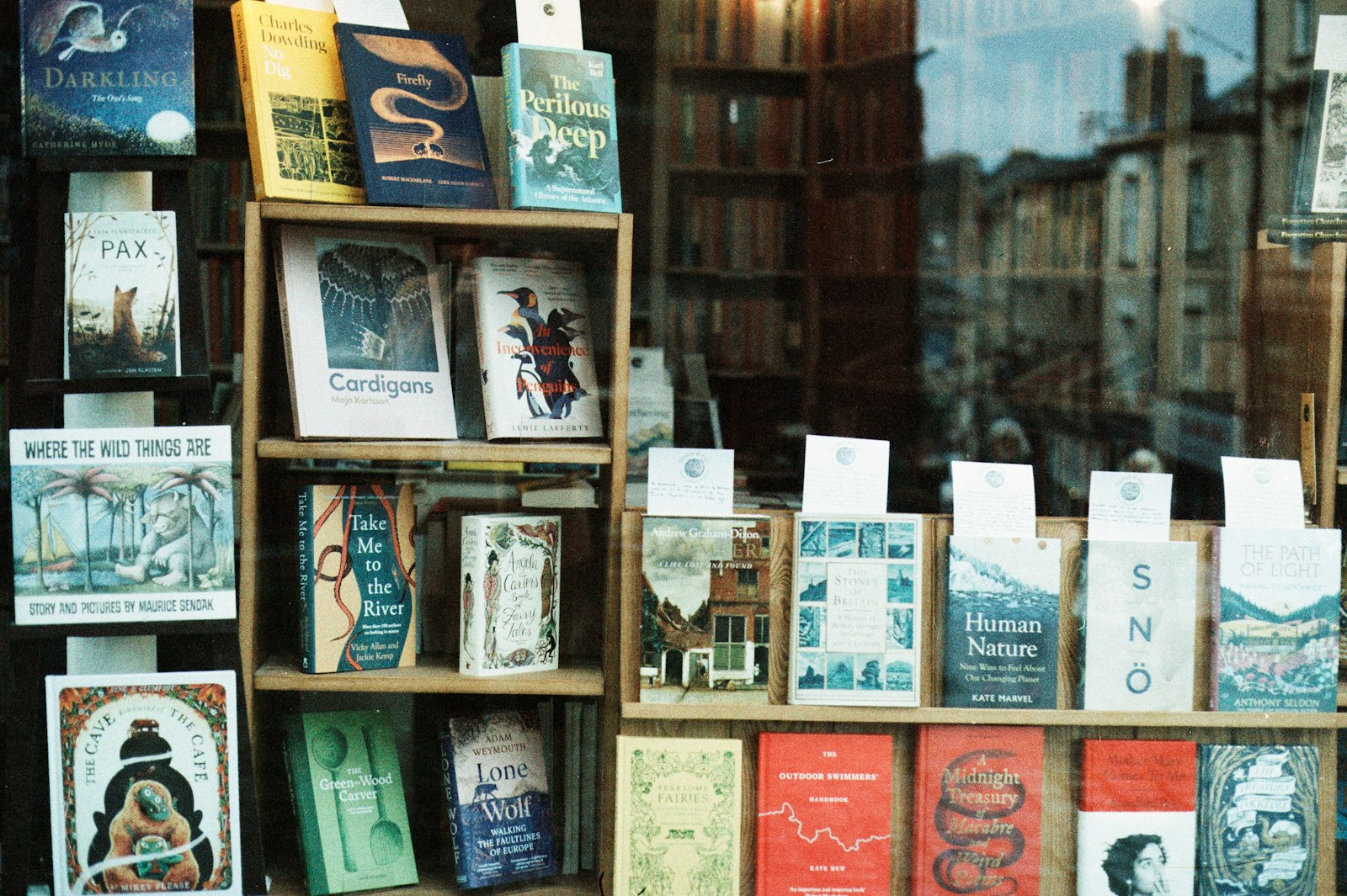
- Huge author names usually mean the publisher is selling the writer more than the book. It is common for established bestsellers.
- Silhouetted figures walking away have long suggested a suspense or thriller story.
- Bright illustrated couples are a strong signal of romantic comedy.
- Minimal text on a plain or textured background often signals literary fiction or a prize contender.
- Short endorsements from other authors suggest the publisher is trying to place the book in a community of readers.
When covers mislead
The trouble with signals is that they flatten differences. I have seen genuinely strange, experimental novels packaged to look like cosy summer reads, and readers who bought them expecting comfort were baffled. I have also seen thoughtful, serious books disguised by playful covers lose the audience that would have loved them.
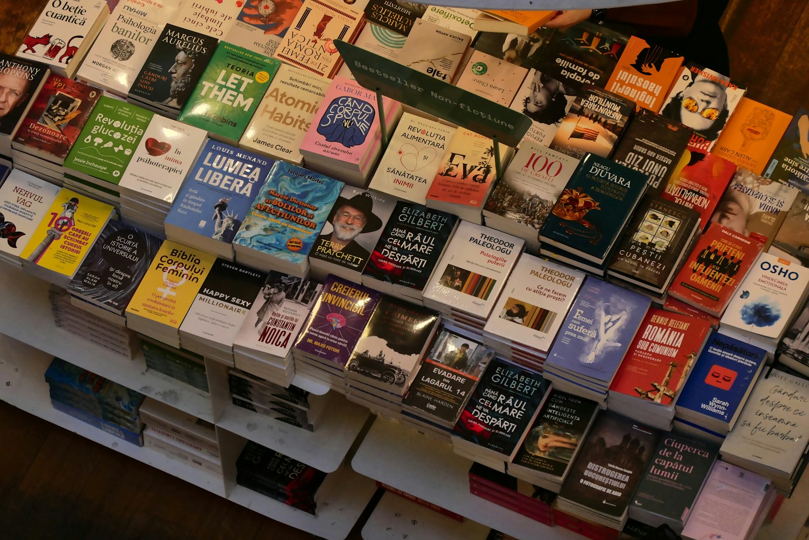
Translated fiction has an extra wrinkle: the same book can look completely different in different countries, because each market has its own visual codes. A novel that looks austere in one edition can look like a beach read in another.
How to browse past the cover
- Read the first page, not the blurb. Voice tells you more than any design.
- Check who published it. Smaller presses often have a recognisable taste.
- Ask a bookseller. We are usually delighted to explain what a book is actually like.
- Notice when you are drawn to a design only because it resembles something you already enjoyed.
Why it still matters
I do not think cover trends are a problem. They help people find books, and a beautiful cover is a small pleasure in itself. But it is worth knowing that a cover is an argument about who a book is for. You are allowed to disagree with it.
Cover: Photo by Kamakshi subramani on Unsplash.