A Field Guide to Button Hierarchy for Teams Who Argue About Blue
Most button debates are not about colour. They are about which action matters most, and that is a decision, not a style.

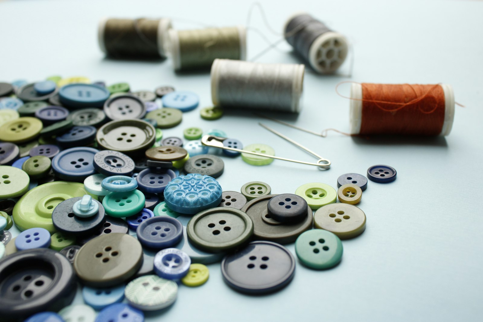
I once sat in a 50-minute meeting about whether a button should be blue or green. Six smart people, strong opinions, a projector warming up the room. We picked blue. Two weeks later a different team made the same button green on another screen, and the debate started again.
The colour was never the real question. The real question was: which action on this screen matters most? Once you answer that, the visual treatment mostly follows.
Three levels are usually enough
In almost every product I have worked on, buttons fall into three levels.
- Primary. The single most important action on the screen. Solid fill, high contrast, your brand colour. There should be one per view, maybe two in rare cases.
- Secondary. Useful alternatives. Outlined or with a subtle fill. Visible but clearly less important.
- Tertiary. Low-emphasis actions like Cancel, Learn more or Skip. Often text-only, sometimes with an underline on hover.
There is also a fourth, special case: destructive actions like Delete account. These get their own colour, usually red, and are rarely primary unless the entire screen exists to confirm deletion.
The one-primary rule
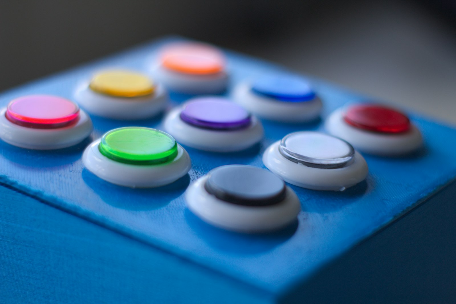
The most common mistake I see is screens with three or four primary buttons. When everything is loud, nothing is. Users have to read every label to find what they need, which slows them down and increases mistakes.
In one audit of a settings page, we found five solid buttons in a single viewport. After reducing it to one primary and four secondary buttons, task completion time in testing dropped by about 18 percent, with no other changes.
Placement matters as much as style
Hierarchy is not only fill and colour. Position matters too:
- Consistent order. Decide whether the primary action sits on the right or the left of a group, then never change it.
- Proximity. Place actions close to the content they affect. A Save button far from the form feels disconnected.
- Size. Primary buttons can be slightly larger or full width on mobile. Do not make secondary buttons tiny, though, or they become hard to tap.
Write the label first
Before styling any button, I write its label. Good labels describe the outcome: Send invoice, not Submit. Create project, not OK. A clear label often reveals hierarchy on its own, because you can see immediately which action the user came for.
Ending the blue versus green debate
The fix for my old team was not a better colour. It was a small, documented component with three variants and one rule: one primary per screen. Once that existed, colour discussions basically stopped.
A design system does not end arguments. It moves them to one place, where they only need to happen once.
If your team keeps debating colour, step back and ask which action matters most. The answer will tell you more than any colour swatch.
Cover: Photo by Merve Sehirli Nasir on Unsplash.