Why I Kerned One Headline for Forty Minutes (and Don't Regret It)
A small confession about letter spacing, optical illusions and the difference between correct and right.


Last spring, I spent forty minutes adjusting the space between the letters of a five-word headline. My colleague walked past twice, the second time with a raised eyebrow. In fairness, the headline looked almost identical before and after.
Almost. That word is the whole story.
What kerning actually is
Kerning is the adjustment of space between specific pairs of letters. Fonts come with built-in kerning tables, which handle common pairs well. But at very large sizes, like a landing page headline at 96 pixels, small inconsistencies become visible.
The classic offenders are pairs like AV, To, Wa and LT. Their shapes create pockets of empty space that make the gap look bigger than the space between, say, n and m, even when the measured distance is the same.
Measured versus perceived
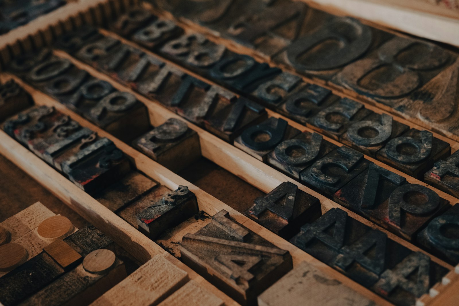
This is the part that hooked me years ago. Type is not spaced by measurement. It is spaced by perceived area. Two round letters like o and c need to sit closer than two straight letters like l and i, or they look farther apart.
Your eye judges the volume of white space between shapes, not the distance between their edges. That means correct spacing often looks wrong, and right spacing is often mathematically uneven.
The headline in question
The headline was for a product launch: five words, set in a geometric sans serif at 88 pixels. The default kerning was perfectly acceptable. But three things bothered me:
- The Ta at the start had a gap you could drive a small car through.
- An rv pair in the middle felt crowded by comparison.
- The word spaces looked uneven because of the letters next to them.
I adjusted seven pairs in total, most by just 10 to 20 thousandths of an em. Then I flipped the headline upside down, an old trick that stops you reading the words and forces you to see shapes. Two more adjustments. Then I stopped.
Was it worth forty minutes?
Honestly, nobody visiting the page would consciously notice. But I think they would feel it. Evenly spaced type reads as calm and confident. Uneven type reads, faintly, as careless, even if the reader cannot say why.
That headline was seen by about 200,000 people. Forty minutes divided by 200,000 visits is not a bad ratio.
When to bother and when not to
I do not kern body text. Built-in kerning handles that well, and the sizes are too small for manual changes to matter. I focus on:
- Hero headlines and display type above about 40 pixels.
- Logos and wordmarks, which are seen thousands of times.
- Short, all-caps labels, where letter pairs are especially exposed.
Good spacing is invisible. Bad spacing is invisible too, until it quietly makes everything feel slightly off.
I would spend the forty minutes again. I might just do it when my colleague is at lunch.
Cover: Photo by Declan Sun on Unsplash.